Post 2
-
Jayden Pooran – Discussion Post 2
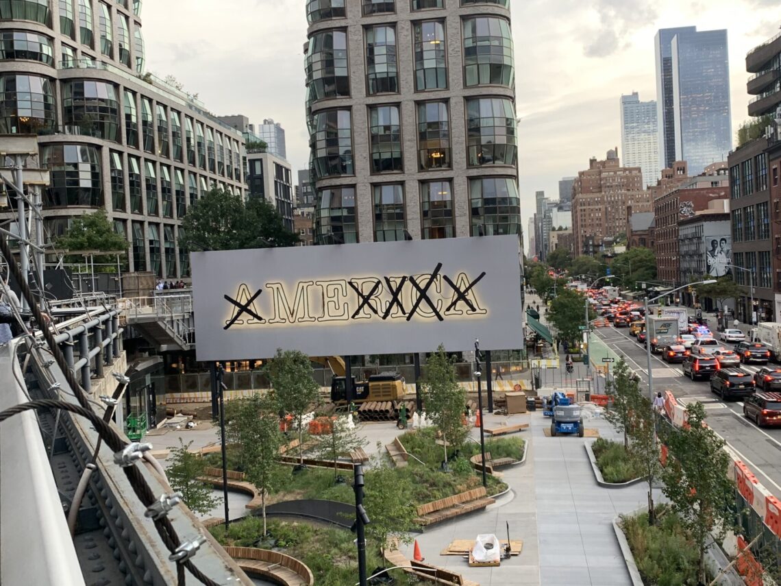
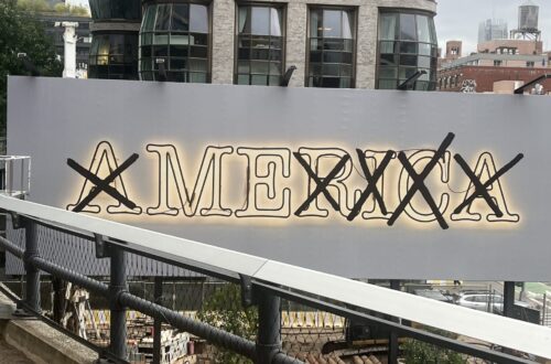
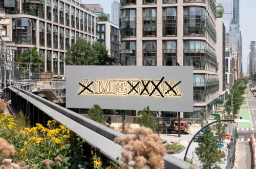
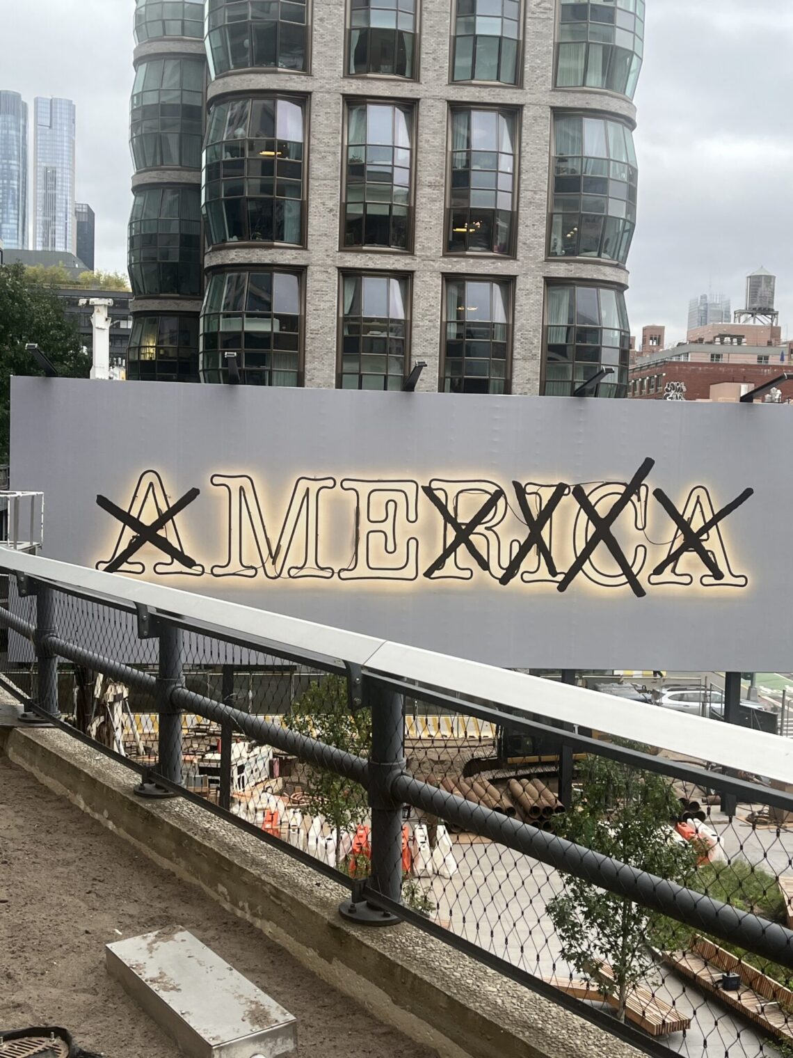
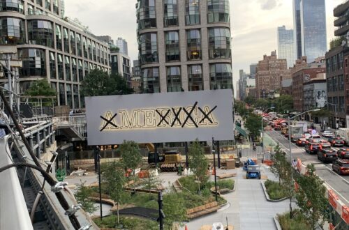
I chose the artwork on a billboard that said America in which all of the letters were crossed out except “ME” because it stood out to me the most. At first sight, I only saw the letters “m’ and “e” which automatically signaled that there was a hidden message behind the other letters just being crossed off. The spacing between each letter is identical and the empty background outside of the letters gives more emphasis to the words. Delving deeper, the “X’s” on each letter except the “ME” are all slightly different shapes. The word “ME” inside of “America” brings up a tension between the two. I believe it’s referencing…
-
Lesley’s High Line Analysis
Part 1 Untitled (America/Me) by Glenn Ligon is a billboard at 18th Street and 10th Avenue depicting “AMERICA” in neon letters that are crossed out to just spell “ME.” Ligon based Untitled (America/Me) off of his 2008 installation Untitled, which was a flickering neon sculpture. He captured it in a photograph and added black, hand-drawn X’s of varying size that are bold and somewhat erratic. The X’s seem to be drawn with marker, as the lines aren’t completely straight and bleed a little. The background of the image is white so that AMERICA, big and centered, stands out in neon yellow. The relative simplicity of this artwork compared to the…
-
Astan Diarra’s Discussion Post 2
This billboard adds to the aesthetic of the High Line because it highlights the fact that America came to be because of people acting selfishly. America was found on accident and yet it was built on the suffering of others because the settlers only saw it as another way to get more money. They only worried about their own goals and are not afraid of ruining other people’s lives to achieve it. The High Line wouldn’t exist if the people who lived there did not stand up and defend their home from people who were only seeking profits wanted to demolish the old train tracks. The High Line is proof…
-
Bosco Wong Discussion Post #2
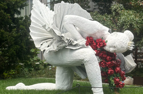
Part #1: Curtain Call is a public sculpture on New York City’s High Line that shows a dancer bowing while holding a bunch of red roses. The sculpture is formed of a rough, textured substance; nonetheless, despite this rough texture, the figure represents elegance and delicacy, as seen in the crown on the head, the smooth, flowing contours of the dancer’s body, and the precise folds of the tutu. Therefore, when examined more closely, the rough texture and the composition of the dancer’s focal point of one knee to the elevated green grass contribute to the overall aesthetic of the High Line because, just as the High Line is an…
You May Also Like
Jayden Pooran’s Discussion Post 1
-
Discussion Post #2: The High Line Analysis
Part 1: Analysis The photo I chose was of the landscape between 13th and 16th street. I chose this image because I think it displays a lot of the High Line’s character and shows the intentionality that everything is placed with. The first major aspect of this picture is the huge, grey, industrial building; it has a very rectangular shape, composed of grey bricks with rigid corners, the details shown throughout the building being various lines made to provide separation between columns and windows. The windows are large, almost factory-like, and are representative of the historical neighborhood that the High Line is located in. By submitting to the theme of…
-
Jigna Oza High line
-
Shimmy Jeselsohn Discussion post 2
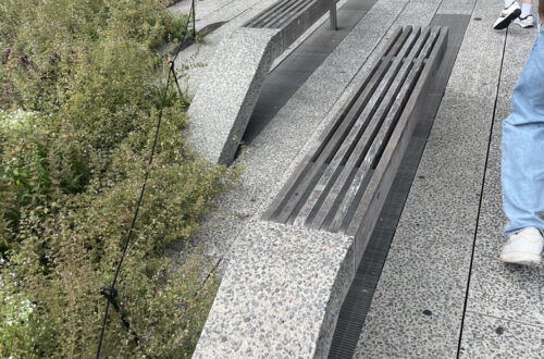
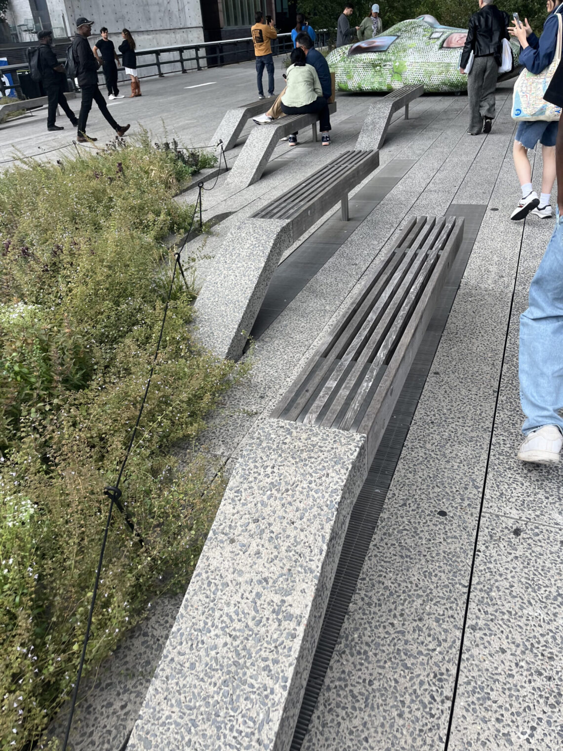
For my image I am analyzing I am choosing the picture I took of the benches on the Highline. What might seem like an insignificant object, I think these benches actually bring a lot to the Highline and the aesthetic. The first thing I notice about this bench is the odd shape that it takes. For most basic benches one does not really think about it, but here the way it curves up on one side and ends abruptly on the other means something. I think this first just represents the Highline as a whole, the way the bench curves up represents the Highline being raised up from the ground…